
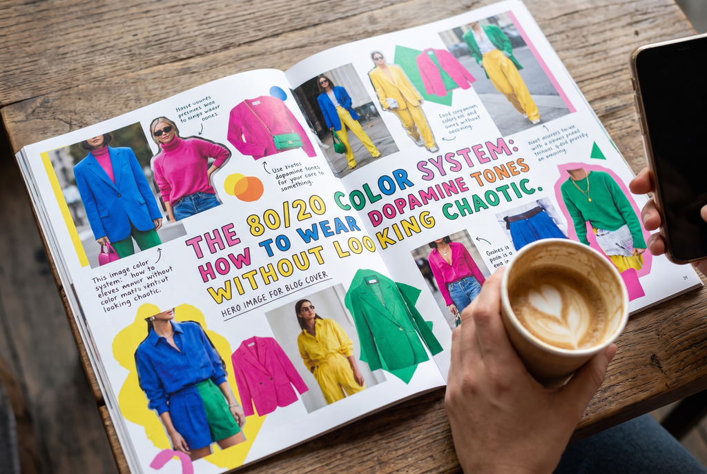
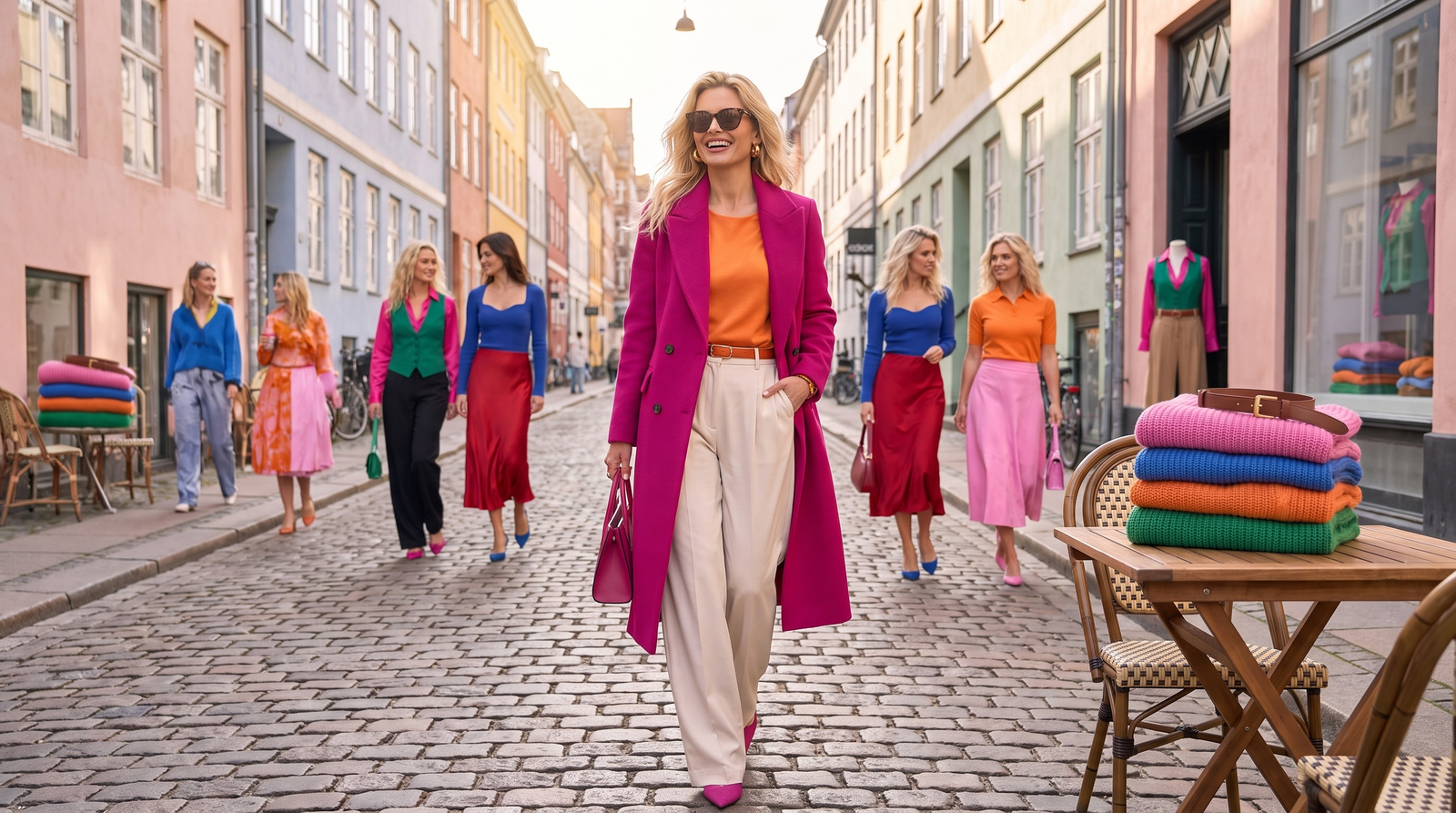
Want the dopamine dressing serotonin of a bright outfit without looking like you got dressed in the dark? Try the Nordic 80/20 color rule.
All products are personally selected by us. If you buy something, we may earn an affiliate commission
Bright colors can lift your mood without turning your wardrobe into a rainbow. The secret is the Scandinavian 80/20 color system: keep 80% of your outfit structured and neutral, then let one saturated shade do the talking.
There’s a certain kind of morning when your closet feels completely uninspiring. It’s gray outside. Your calendar is packed. Your creative brain has apparently taken the day off. You reach for the same charcoal sweater you’ve worn approximately 400 times and wonder whether wearing something bright might actually improve your mood.
Table of Contents
Then you see the electric-blue trousers hanging in your closet.
You love them.
You’re also convinced they’ll make you look like a walking highlighter.
So back onto the hanger they go.
Here’s the good news: you don’t need to dress head-to-toe in color to make a colorful outfit work. In fact, one of the easiest ways to make bold shades feel sophisticated is to use less of them.
Enter the 80/20 color system.
The idea is wonderfully simple: keep roughly 80% of your outfit neutral, structured, and timeless, then devote the remaining 20% to one saturated, mood-boosting color.
Think charcoal trousers with a fiery-red sweater.
A cream coat with a cobalt-blue bag.
A navy suit with a pistachio-green knit.
Or a gray trench coat with one flash of vibrant color peeking out from underneath.
It’s dopamine dressing—but with a seatbelt.
Read more: Best Pastel Dinnerware for an Elegant Everyday Table | Scandinavian Table Style
Why the 80/20 Rule Works
Bright colors have visual weight.
Put several highly saturated colors together and your eye has nowhere to rest. Add bold prints, statement jewelry, chunky shoes, and competing silhouettes, and suddenly your outfit is doing far more talking than you are.
The 80/20 approach creates a visual hierarchy.
The neutral 80% establishes the silhouette.
The colorful 20% creates the surprise.
That balance is one reason Nordic -inspired wardrobes often feel simultaneously relaxed, practical, and polished. The clothes aren’t necessarily boring; they’re edited. Instead of asking, “How many fun pieces can I wear today?” ask:
“Which one piece deserves the spotlight?”
That tiny change in thinking can completely transform how you get dressed.
The Contrast Rule: Give Every Bright Color an Anchor
Not all neutrals work equally well with every saturated shade.
This is where the 80/20 system gets interesting.
Rather than throwing a bright color against black because black goes with everything, consider the temperature and visual character of the color you’re wearing.
Tomato Red + Deep Navy
Bright tomato red can look surprisingly sophisticated next to deep navy.
Why?
Navy is softer than black but still has enough depth to ground an intense red. The result feels nautical, European, and expensive rather than overly dramatic.
Try:
The red gets to be bold without becoming the entire outfit.
Cobalt Blue + Charcoal
Cobalt is energetic, crisp, and unapologetically blue. Charcoal gives it somewhere to land.
Try a cobalt sweater with tailored charcoal trousers, or use a cobalt handbag against a charcoal coat. The cool-toned pairing feels modern without becoming overly colorful.
Pistachio Green + Cream
Pistachio is softer than emerald but more energetic than beige or sage.
Pair it with cream, ivory, or oatmeal and you’ve got an easy combination that feels fresh without screaming for attention.
A pistachio cardigan over an ivory T-shirt with cream or stone trousers is practically a cheat code for spring-like energy—even when the weather refuses to cooperate.
Read more: 7 Pastel Colors That Make a Home Feel Calm, Not Cluttered
The Texture Lock: Color Needs Good Fabric
Here’s a styling trick that doesn’t get enough attention:
The brighter the color, the more important the texture can become.
Highly saturated colors can sometimes look less sophisticated when they’re paired with very thin, shiny, or visibly inexpensive synthetic fabrics. That doesn’t mean synthetic fibers are automatically bad. Fabric quality depends on construction, finish, weight, and fiber content; but when you want a bright color to look elevated, texture gives the eye something more interesting to process.
Think:
Heavyweight cotton.
Crisp poplin.
Quality leather.
A saturated red in a substantial wool knit can feel luxurious.
The same color in an ultra-thin, shiny polyester top may feel much more costume-like.
The lesson isn’t “never wear synthetics.”
It’s pay attention to surface and structure.
If you’re buying one colorful piece, make it a piece with enough substance to carry the color beautifully.
The Easy Starter Piece: A Colorful Knit
If you’re nervous about dopamine dressing, start with a sweater.
It’s large enough to make an impact but easy enough to style.
A useful shopping option is UNIQLO’s Merino Crew Neck Sweater, which is a practical base for experimenting with color because the classic silhouette can be paired with trousers, jeans, skirts, or layered under outerwear. Color selections vary by season, so check the current UNIQLO women’s merino sweater collection.
The beauty of a simple knit is that you don’t need to rebuild your wardrobe around it.
Your existing navy trousers can do the job.
So can your gray jeans.
So can cream pants.
That’s the whole point.
Buy the color, not an entirely new outfit.
The Accessory Bridge: For People Who Are Color-Shy
Still not convinced you can wear cobalt trousers at 8 a.m. on a Tuesday?
No problem.
You don’t have to put dopamine color directly next to your face.
This is one of the easiest ways to ease into brighter shades: confine the color to accessories.
Start small.
Step 1: Choose a neutral base
Try a gray trench, navy trousers, cream knit, or charcoal suit.
Step 2: Select one saturated accessory
Think cobalt blue, cherry red, bright green, or vivid yellow.
Step 3: Keep everything else quiet
Don’t introduce another competing color.
Step 4: Let the accessory appear almost accidentally
A bright sock peeking out above a loafer can be enough.
So can a colorful leather handbag hanging against a gray coat.
Or a vivid belt worn with cream trousers.
Or a bright scarf tied around the handle of a neutral tote.
The closer the color is to the ground, the less intimidating it can feel.
And here’s the magic: you still get the psychological lift of seeing a bright color throughout your day.
The 80/20 Rule Doesn’t Mean You Need to Measure Anything
Please don’t stand in front of your mirror calculating percentages.
Nobody needs that kind of pressure before coffee.
The 80/20 ratio is a styling principle, not a mathematical requirement.
The real rule is:
Let neutrals create the foundation and let one color create the energy.
A colorful sweater might technically be closer to 30% of your outfit.
Who cares?
If the overall look feels balanced, you’re doing it right.
Think of 80/20 as a visual shortcut.
It tells you when to stop adding.
Because that’s often the hardest part.
You put on the red sweater.
Then you think, “Maybe red shoes?”
Then, “Perhaps the red bag?”
Then suddenly you’re one statement earring away from looking like a walking Valentine’s Day display.
Put the accessories down.
The sweater has already done the work.
Three No-Fail Dopamine Outfit Formulas
Want something you can actually use tomorrow morning?
Try one of these.
1. The Copenhagen Commute
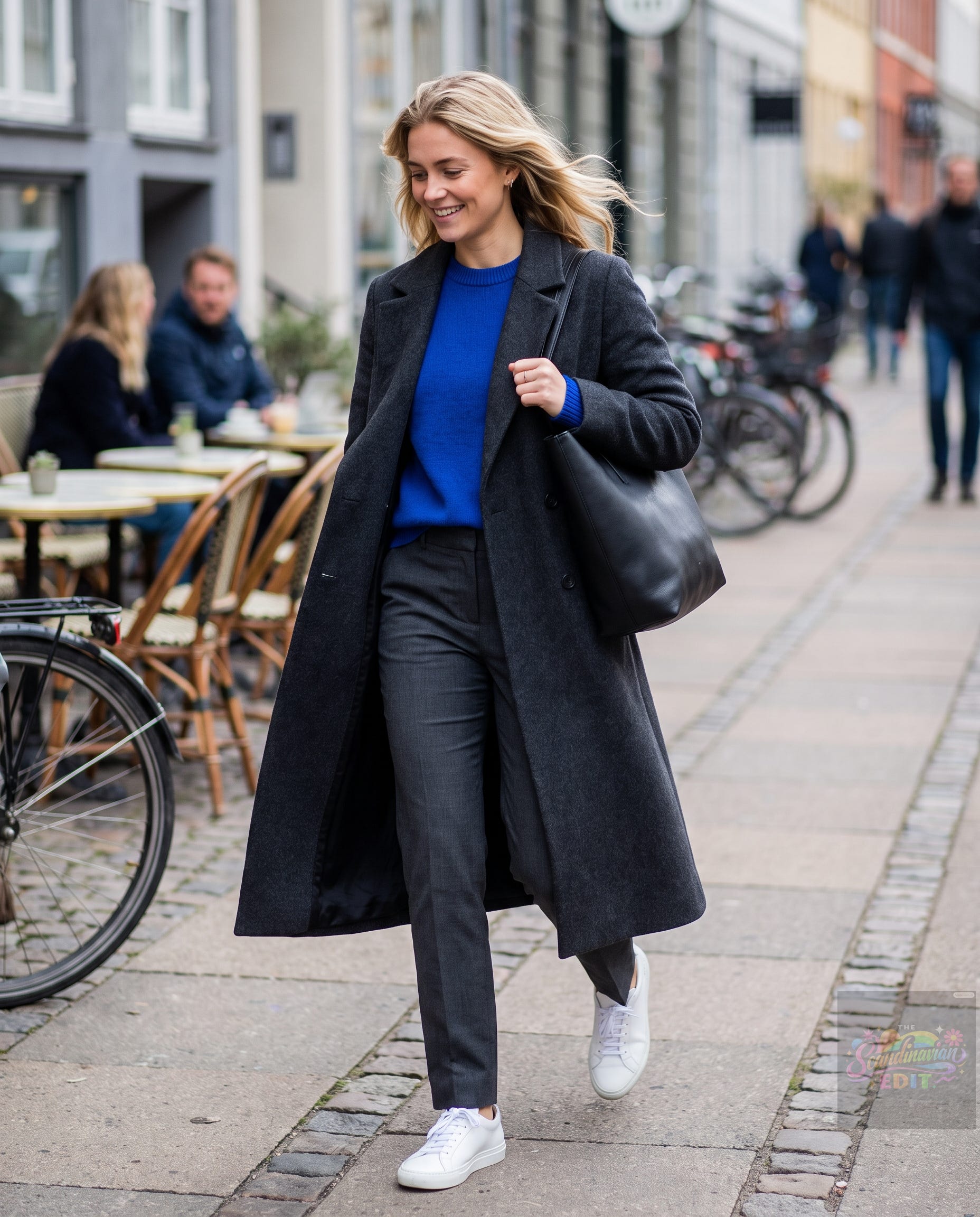
- Charcoal tailored trousers
- Cobalt-blue sweater
- Long gray or charcoal coat
- Minimal sneakers or loafers
- Simple black or brown bag
The silhouette stays serious. The color keeps it alive.
2. The Red Accent

The warm red becomes the focal point while navy provides the structure.
3. The Color-Shy Version
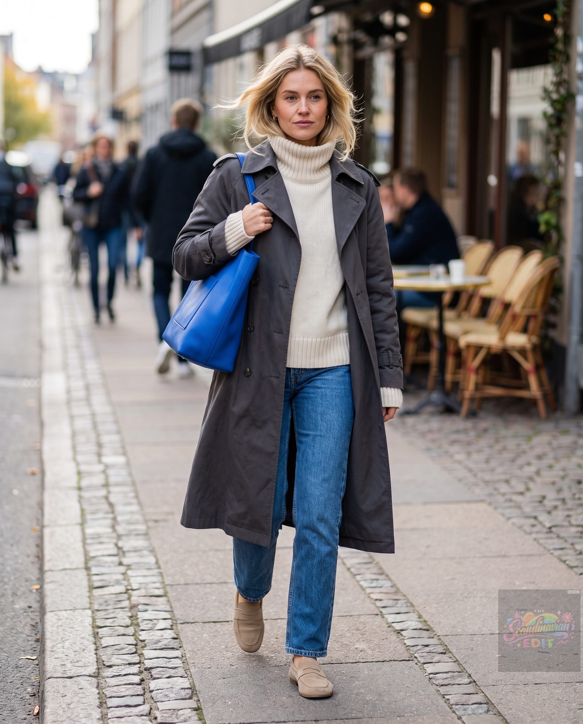
This is dopamine dressing for people who don’t actually want everyone staring at their clothes.
What About Wearing Two Bright Colors?
You can.
Absolutely.
But if you’re trying to create a polished, Scandinavian-inspired effect, start with one saturated color.
Once you’re comfortable, you can experiment with color relationships such as complementary or analogous shades.
The trick is maintaining hierarchy.
If you wear bright red, electric blue, neon green, and yellow simultaneously, you’re no longer working with an 80/20 system.
You’re throwing a party.
Sometimes that’s exactly what you want.
But if the goal is timeless, polished, mood-boosting style, restraint is your friend.
You Don’t Need a New Wardrobe
This may be the most useful part of the entire system.
You probably already own the 80%.
Look at your closet.
Do you have:
- Gray trousers?
- Navy pants?
- Cream sweaters?
- White shirts?
- Denim?
- A neutral coat?
- Black, brown, or tan shoes?
Congratulations.
You’ve already built the foundation.
Now you only need one piece that makes you smile.
Maybe it’s a bright knit.
Maybe it’s a handbag.
Maybe it’s a pair of socks.
Maybe it’s a scarf.
Don’t buy ten colorful things because you’re suddenly inspired by dopamine dressing.
Buy one great thing and see how often you wear it.
If you reach for it constantly, you’ve found your color.
A Little Color Can Change the Mood of an Ordinary Day
Clothing can’t solve seasonal depression, burnout, or a genuine creative block. Those deserve real support and care.
But clothes can influence how we experience an ordinary morning.
There’s something undeniably pleasant about opening your coat and seeing a flash of cobalt.
Or catching a red sock in the mirror.
Or wearing a pistachio sweater on a gloomy Wednesday simply because you decided the day could use a little more color.
That’s the charm of dopamine dressing when it’s done thoughtfully.
It isn’t about being louder.
It’s about being more intentional.
The Final Color Check
Before leaving the house, look in the mirror and ask three questions:
What’s the foundation?
If the answer is a neutral, structured silhouette, you’re on the right track.
What’s the focal point?
Ideally, one saturated color should immediately catch your eye.
What can I remove?
This is the secret weapon.
If you have three statement elements fighting for attention, remove one.
If your bright sweater is already doing the talking, let it talk.
The most stylish person in the room isn’t necessarily wearing the most color.
Often, she’s the person who knows exactly where to put it.
Your New Rule
You don’t need to become a maximalist.
You don’t need a rainbow wardrobe.
And you certainly don’t need to abandon your love of gray trousers and navy coats.
Just give your neutrals one good friend.
80% structure. 20% serotonin.
That’s the sweet spot.
So tomorrow morning, when the weather is gray and your wardrobe feels a little blah, don’t buy a completely new personality.
Put on the charcoal trousers.
Grab the cream coat.
Add the cobalt sweater.
Or tuck a bright red sock into your favorite loafer.
Then walk out the door.
A little color goes a long way.
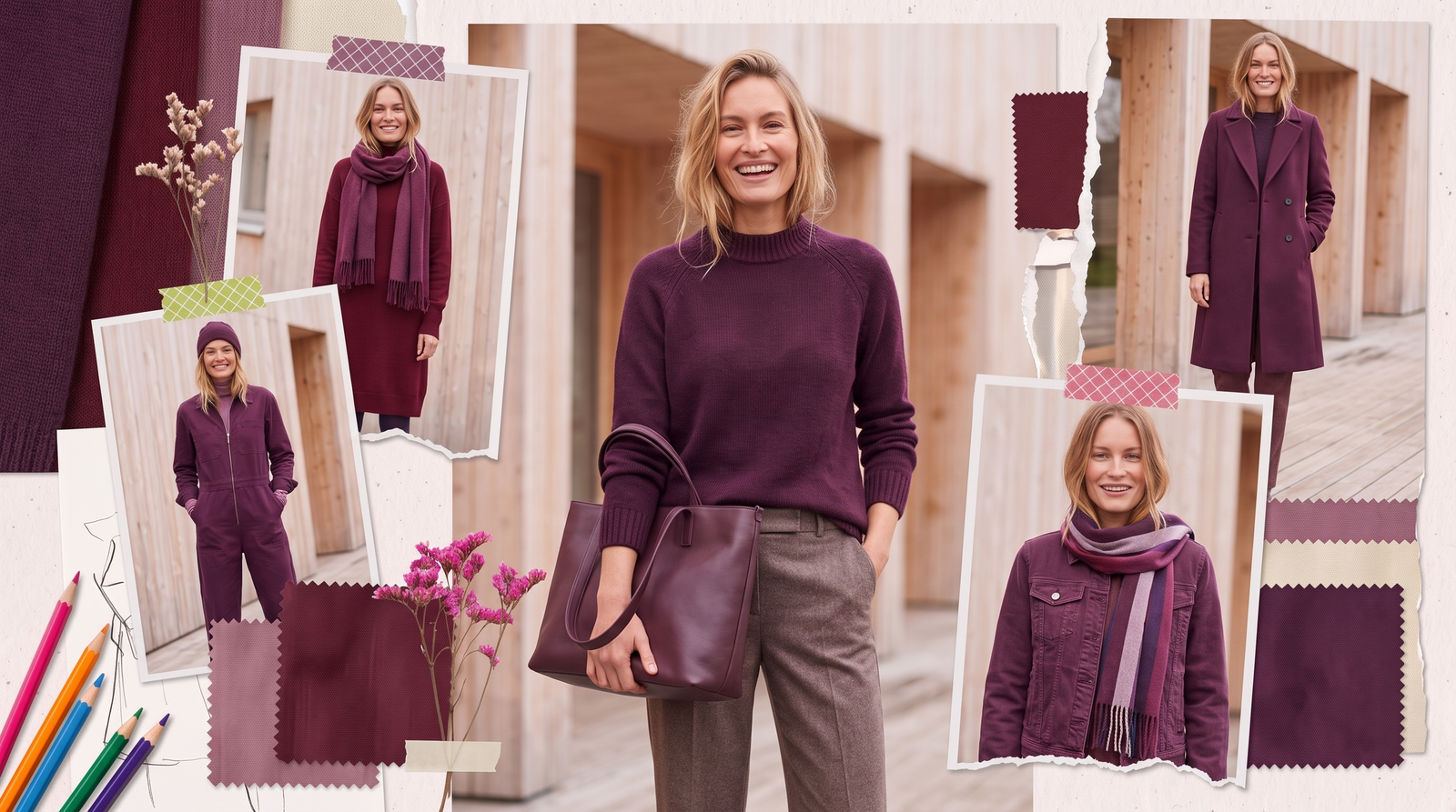

5 thoughts on “The 80/20 Color System: How to Wear Dopamine Tones Without Looking Chaotic”