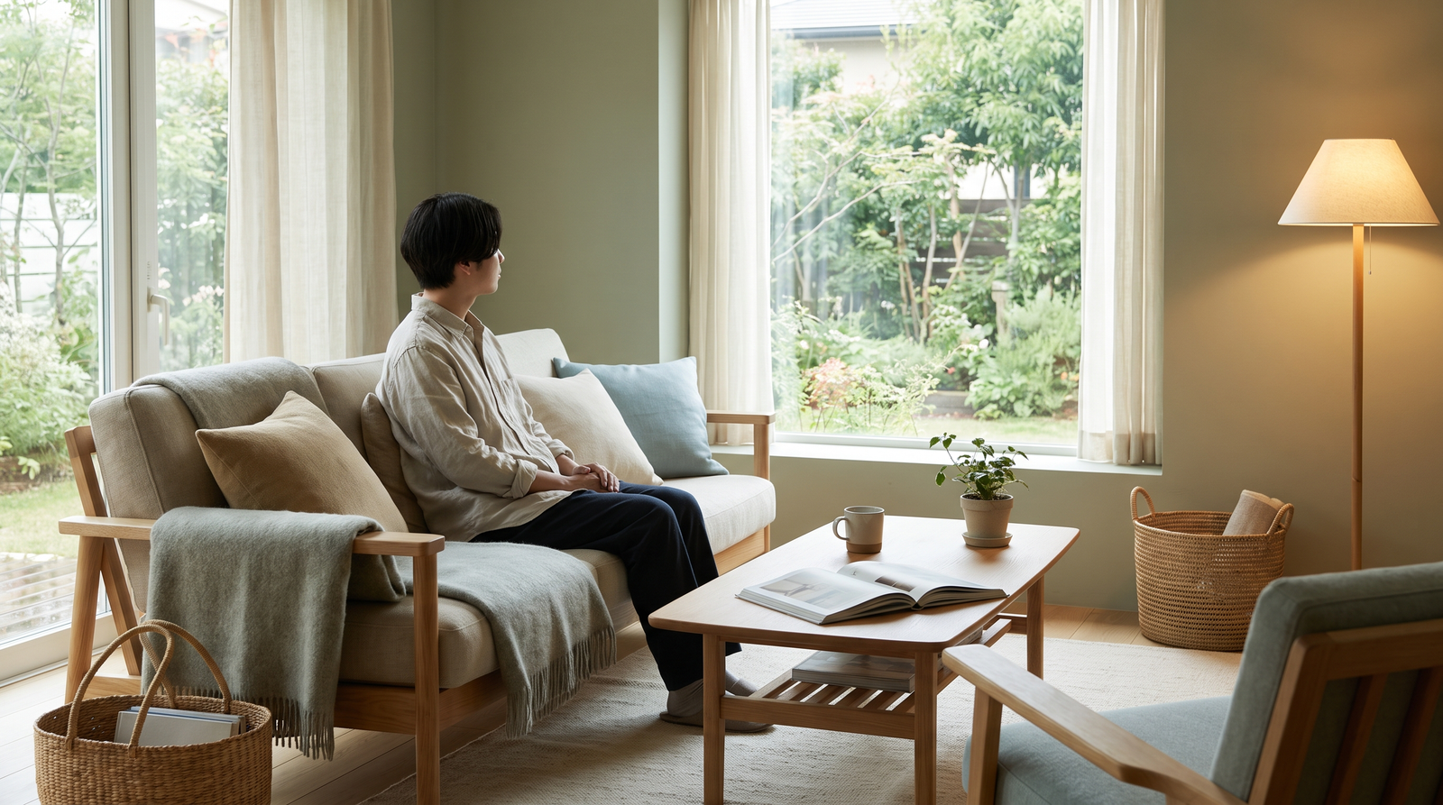
Learn how Nordic anti-anxiety color palette, muted paint shades, tonal textures, and natural linen can make a busy family home feel calmer without becoming boring.
All products are personally selected by us. If you buy something, we may earn an affiliate commission.
If walking through your own front door feels like entering a brightly lit to-do list, your anti-anxiety color palette might be part of the problem. There’s a particular kind of exhaustion that happens when you finally get home—and your home immediately asks something of you.
The toys are everywhere. The backpacks are dumped by the door. Someone left a cereal bowl on the coffee table.
There are fingerprints on the wall, a pile of laundry is waiting for judgment; and then there’s the room itself: bright white walls, dark furniture, colorful toys, patterned cushions, black picture frames, a television glowing in one corner, and approximately seventeen competing shades of beige.
Table of Contents
You haven’t even taken your shoes off, and your eyes are already processing information.
For busy parents, this can be surprisingly draining.
The problem isn’t that your home is “messy.”
Homes with children are supposed to look lived in.
The problem is visual competition.
When every surface, color, pattern, and object demands attention, your home can become another source of stimulation instead of the place where you recover from it.
That’s where Scandinavian-inspired color theory offers a useful idea:
Don’t make your home visually silent. Make it visually quieter. You don’t need an all-white minimalist house.
You need fewer abrupt transitions, softer contrasts, and enough texture to make neutral colors feel warm rather than sterile. Think of it as creating a sensory sanctuary—a home that can absorb a little family chaos without amplifying it.
The Hidden Anxiety of High-Contrast Rooms
Let’s start with something simple.
Your eyes are constantly taking in information.
Color contrasts, movement, patterns, bright lights, clutter, and changing shapes all contribute to the amount of visual information in an environment.
This doesn’t mean a particular paint color directly causes anxiety. Human responses to color are highly individual, and research around color psychology is much more nuanced than “blue makes you calm” or “red makes you anxious.”
But there is a practical design principle here:
The more competing visual elements you have, the harder the room can feel to visually process.
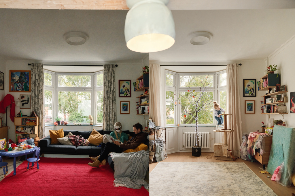
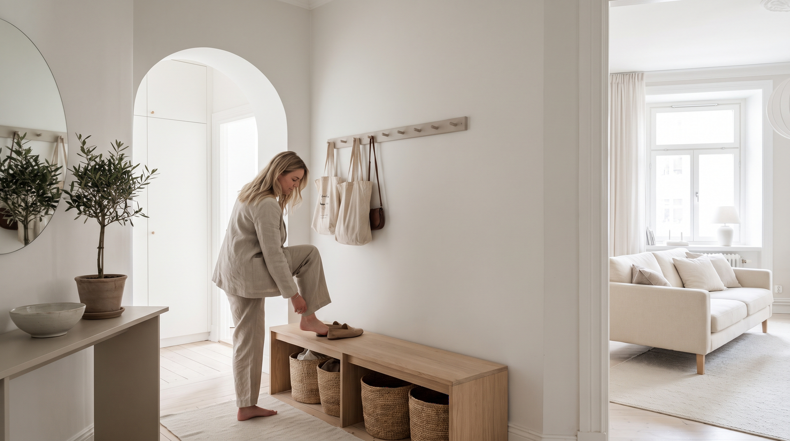
Scandinavian design isn’t about removing life from a room—it’s about reducing visual collisions. Picture a space filled with bright primaries, patterns, and competing focal points. Now imagine the same room softened with chalky walls, an oatmeal sofa, muted greens, natural wood, and a faded rug.
The toys are still there, the kids are still there, the laundry hasn’t magically disappeared—but the environment feels calmer because the palette is quieter. That’s the Scandinavian trick: fewer loud elements, more harmony.
You don’t necessarily remove life from the room. You lower the volume around it.
Why Brilliant White Can Feel So Harsh
Pure, brilliant white is popular because it looks clean and makes rooms appear brighter.
But there’s a difference between bright and comfortable.
In rooms with strong daylight, glossy finishes, cool LEDs, and high-contrast furniture, an extremely bright white can reflect a lot of light and make every edge feel sharper.
That can be especially noticeable in family spaces where there are already plenty of colorful objects competing for attention.
This doesn’t mean white paint is bad.
It means undertones matter.
Instead of choosing the brightest possible white, consider whites with subtle warmth or gray, beige, pink, or green undertones.
The result can feel softer without becoming dark.
And matte finishes can further reduce the visual glare associated with glossy surfaces.
Enter the Chalky Nordic Palette
Nordic interiors often embrace colors that look as though they’ve been softened by weather.
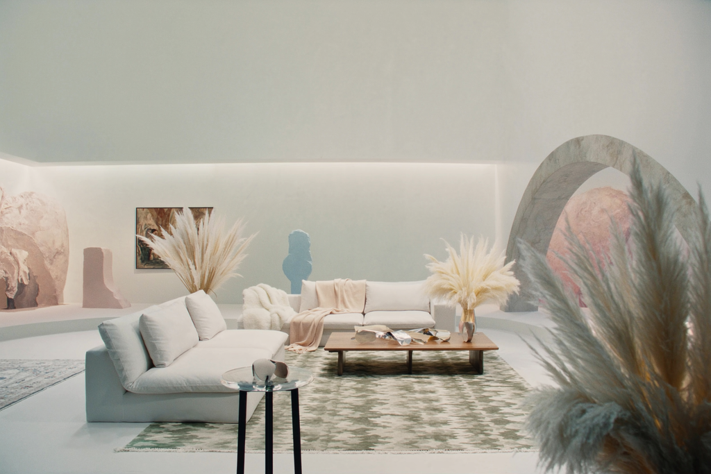
Think:
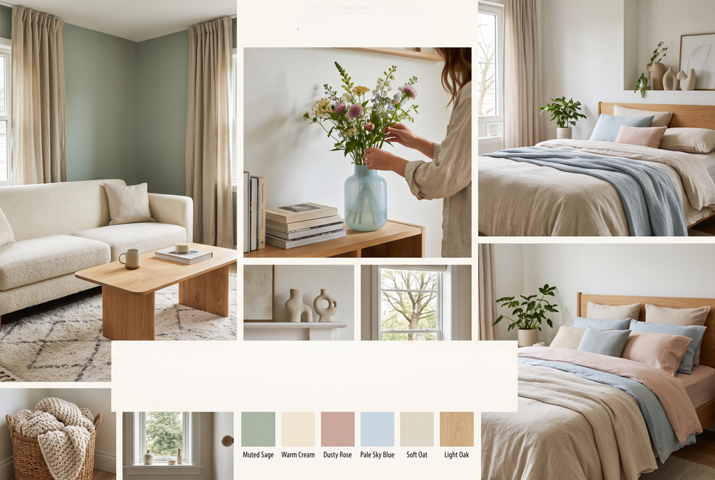
Dusty sage.
Warm ivory.
Damp plaster pink.
Mushroom taupe.
Soft gray-green.
Oatmeal.
Chalky blue.
These aren’t colors that scream for attention.
They whisper.
And that’s exactly what you want in a busy family room.
One product worth considering if you’re looking for an ultra-matte finish is Farrow & Ball Dead Flat, particularly shades such as Setting Plaster or Eddy.
You can explore Farrow & Ball Dead Flat and current color availability here.
Always check the manufacturer’s current specifications and suitability for your particular room before purchasing.
The appeal is less about one magical “calming” shade and more about the combination of muted color + low sheen + tonal surroundings.
Don’t Forget Texture
Here’s where neutral interiors can go wrong.
You choose beige walls.
Beige sofa.
Beige curtains.
Beige rug.
Beige cushions.
Beige everything.
And suddenly your calming Scandinavian sanctuary looks like a waiting room.
The answer isn’t necessarily more color.
It’s more texture.
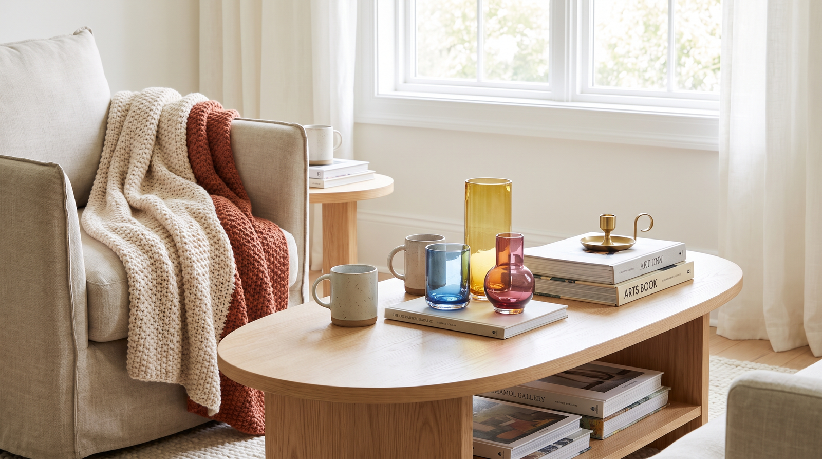
Texture gives neutral rooms depth without introducing another loud visual signal.
Think:
- Slubby linen
- Bouclé
- Wool
- Raw wood
- Woven baskets
- Brushed cotton
- Ribbed ceramics
- Matte stone
- Chunky knits
The colors can remain closely related while the surfaces change.
That’s how you create richness without creating visual noise.
The 60-30-10 Rule—With a Nordic Twist
You’ve probably heard of the 60-30-10 decorating rule.
Traditionally, it suggests:
60% dominant color
30% secondary color
10% accent color
It’s a useful framework, but here’s the Scandinavian adaptation:
Your 10% doesn’t have to be bright.
This is important.
Interior design advice often treats the final 10% as an excuse to introduce mustard yellow, emerald green, cobalt blue, or some other dramatic accent.
But if your goal is a calmer family home, you can keep that 10% within the same tonal family.
For example:
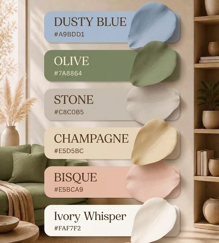
60% warm ivory
Walls, larger furniture, and major surfaces.
30% muted sage
Curtains, cushions, an upholstered chair, or a rug.
10% deeper olive
Ceramics, a small stool, artwork, or a throw.
The room still has contrast.
It just isn’t screaming.
Try Tonal Contrast Instead of Color Contrast
This is one of the easiest changes you can make.
Instead of thinking:
“I need another color.”
Think:
“I need another texture or depth.”
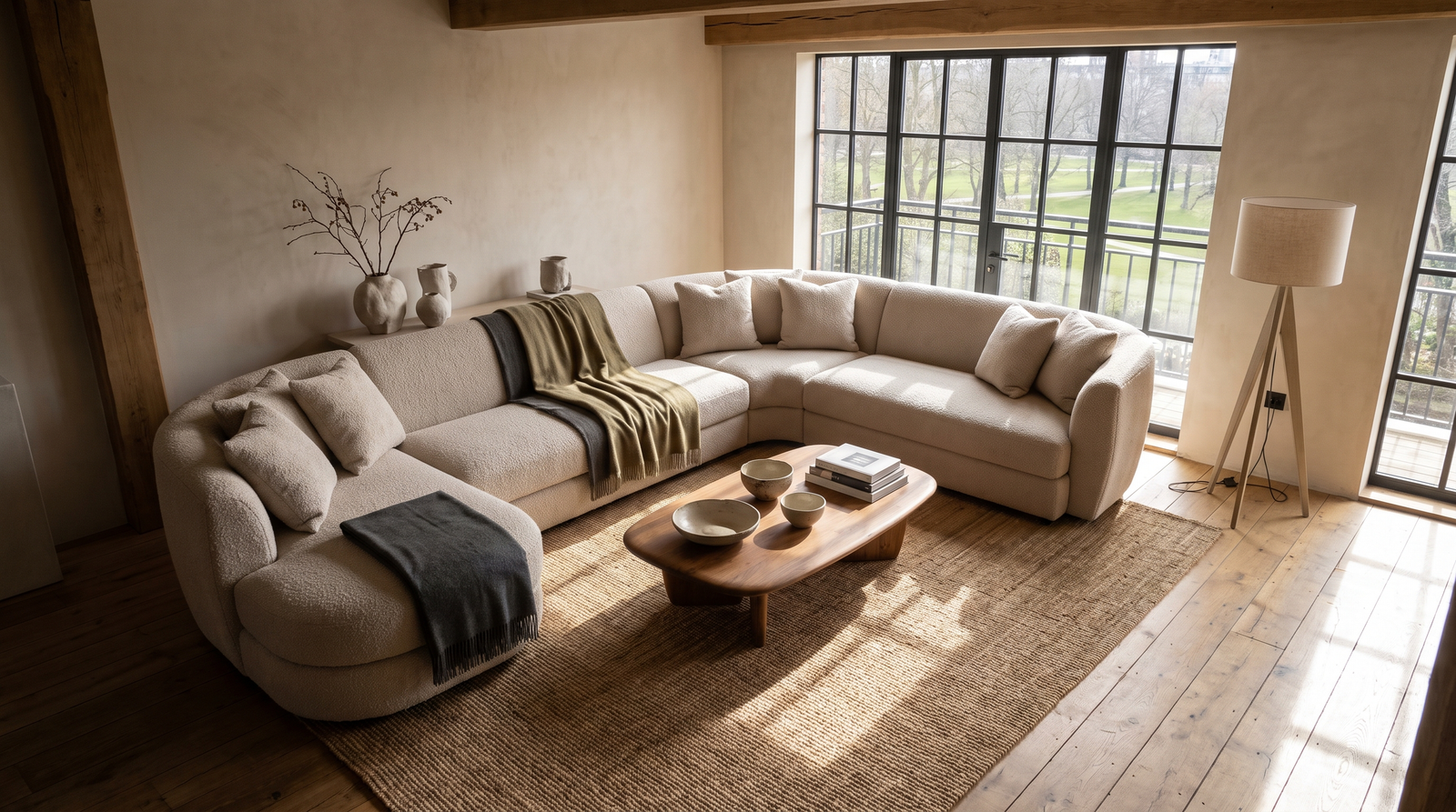
A warm cream wall can sit beside an oatmeal linen curtain.
An oatmeal curtain can sit beside a taupe sofa.
The sofa can sit beside a slightly darker wool rug.
The rug can sit beside a natural oak table.
The colors remain close.
But the textures keep the room from feeling flat.
This is what gives Scandinavian interiors their deceptively rich appearance.
At first glance, everything seems neutral.
Look closer and you’ll find layers everywhere.
The Window Treatment That Changes the Whole Room
Windows are often overlooked when people try to calm a room.
Yet they’re enormous visual rectangles.
If you have dark, high-contrast window frames surrounded by bare walls, the window can become one of the strongest shapes in the room.
Floor-to-ceiling curtains soften that transition.
For a relaxed Nordic look, unbleached oatmeal linen curtains are particularly useful because the natural flax texture adds warmth without introducing a loud pattern.
If you’re shopping online, Etsy has a wide selection of made-to-measure and ready-made linen panels. You can browse unbleached oatmeal linen curtain panels on Etsy.
Check the listing carefully for fabric composition, dimensions, lining, hanging method, and care instructions—linen weights and quality can vary significantly between sellers.
The goal is a curtain that feels substantial enough to soften the window rather than a thin decorative panel that barely changes the room.
And there’s a bonus: textiles can help absorb some reflected sound, although curtains aren’t a substitute for dedicated acoustic treatment if noise control is your primary goal.
Limewash: The Wall Doesn’t Have to Be Perfect
If you want to take the Nordic mood one step further, consider limewash or clay-based wall finishes.
Unlike perfectly uniform paint, limewash can create subtle variation across the surface.
The wall appears to have movement.
It catches light differently throughout the day.
And because the variation is tonal rather than highly contrasting, the effect can feel organic rather than busy.
Bauwerk Colour Limewash Paint is one option worth exploring for this look.
You can shop or explore Bauwerk Colour’s limewash collection and review the manufacturer’s current product information, color options, and application requirements.
As with any specialty wall finish, test samples in your actual room first.
A color that looks like a beautiful muted sage online can look dramatically different under your home’s morning, afternoon, and evening light.
That’s not a flaw.
That’s your room telling you what it needs.
Your Family Home Doesn’t Need to Look Like a Showroom
Here’s where I want to push back against the perfectionism that often accompanies minimalist interiors.
You have children.
You live in your home.
Things happen.
Someone will spill something.
A toy will migrate into the living room.
A backpack will land on the sofa.
There will be fingerprints.
The point of a calming palette isn’t to create a house where nothing can happen.
It’s to create a background that absorbs everyday life gracefully.
A muted wall doesn’t compete with a pile of colorful books.
A natural linen curtain doesn’t fight with children’s artwork.
A tonal rug doesn’t make every stray toy look like another visual emergency.
The home becomes a backdrop for life rather than another character demanding attention.
Your Weekend Color Audit
You don’t need to repaint your entire house this weekend.
Start with one room.
Preferably the room where your family spends the most time.
Stand at the entrance and take a photograph.
Don’t analyze it yet.
Then look at the image and identify:
1. The Loudest Color
What catches your eye first?
Is it the wall?
A rug?
A piece of furniture?
A collection of toys?
2. The Hardest Contrast
Where does your eye jump between two extremes?
Think brilliant white against black, or a saturated color against a pale background.
3. The Repeated Texture
Do you have enough variation in surface?
If everything is smooth and shiny, consider adding linen, wool, wood, or woven materials.
4. The Window
Are your curtains helping soften the architecture or emphasizing it?
5. The 10%
What’s your accent color?
Does it need to be bright?
Or could a darker, muted version create the same visual interest with less intensity?
The Anti-Anxiety Palette Isn’t About Beige
This is probably the biggest misconception.
A calm home isn’t necessarily a beige home.
It’s a coherent home.
You can have green walls.
Blue furniture.
Pink textiles.
Dark wood.
Even black accents.
The trick is controlling the relationships between them.
When colors share undertones and transitions are gradual, the room can feel significantly more cohesive.
That’s why Scandinavian-inspired interiors often feel calm despite having plenty of personality.
They aren’t colorless.
They’re edited.
Start With the Background
If your home currently feels chaotic, don’t start by buying decorative objects.
Start with the biggest surfaces.
Walls.
Curtains.
Rugs.
Sofas.
Large furniture.
These elements establish the visual atmosphere of the room.
Once those are calm, your family’s actual life can provide the contrast.
A child’s yellow raincoat hanging by the door suddenly looks cheerful rather than chaotic.
A stack of colorful picture books becomes an intentional little burst of energy.
A collection of toys doesn’t have to match because the surrounding environment isn’t competing with it.
That’s the secret.
You don’t have to control every color your family brings into the house.
You can control the background those colors live against.
The Bottom Line
A calmer home isn’t created by removing everything you love.
It’s created by giving the eye somewhere to rest.
Choose muted undertones instead of aggressive contrast.
Use matte and chalky finishes where appropriate.
Layer texture instead of constantly adding new colors.
Apply the 60-30-10 rule as a tonal framework rather than a command to buy bright accessories.
Soften large architectural transitions with natural textiles.
And most importantly, design for the life you actually live.
Because the goal isn’t a picture-perfect Scandinavian apartment where nobody is allowed to leave a Lego on the floor.
The goal is a home where the Lego doesn’t feel like another emergency.
Your family already brings plenty of energy into the room.
Your walls don’t have to.
Sometimes the most luxurious thing a busy home can offer isn’t more decoration.
It’s visual quiet.
And when you walk through the door after a long day, that quiet can feel like a little exhale.
3 thoughts on “The anti-anxiety Color Palette: Nordic Theory for a Calmer Home”