This post contains affiliate links. If you purchase through them, I may earn a small commission at no extra cost to you.
Pastels have an image problem. Say the word and most people immediately picture a nursery — baby pinks, powder blues, pale yellows, and the entire gender-reveal color wheel. It’s a shame, really, because the pastel decor coming out of Nordic right now has very little to do with any of that. It’s soft, yes, but it’s soft in the way a beautifully worn linen shirt is soft, not the way a stuffed animal is soft. There’s a real difference, and once you see it, you can’t unsee it.
Table of Contents
I used to be firmly in the “pastels are for baby showers” camp myself. Then I started paying closer attention to how Scandinavian designers were actually using these colors. The shades were dustier and muddier, the furniture had structure, and the materials had some genuine weight to them. There was linen instead of shiny polyester, raw wood instead of painted furniture, brushed brass instead of plastic, and plenty of black to keep all that softness grounded.
That changed my mind completely.
Nordic pastel decor isn’t about making a room sweeter. It’s about introducing color without sacrificing calm, warmth, or sophistication. And once you understand a few simple rules, it’s surprisingly easy to recreate at home.
Why Most Pastel Decor Reads as Childish
It’s rarely the colors themselves that are the problem. It’s everything they’re paired with. A soft pink can look elegant in one room and juvenile in another simply because of the furniture, finishes, proportions, and colors surrounding it.
It’s the Saturation, Not the Hue
Take baby pink. It’s bright, clean, and almost candy-like. Now imagine taking that same pink and adding a little gray or brown. Suddenly you’ve got dusty rose. It’s still pink, but the mood is completely different.
That’s one of the biggest secrets behind Nordic pastel decor. The colors usually sit toward the muted, dusty end of the spectrum rather than the bright, sugary end. The goal isn’t to eliminate color but to take away some of its sweetness.
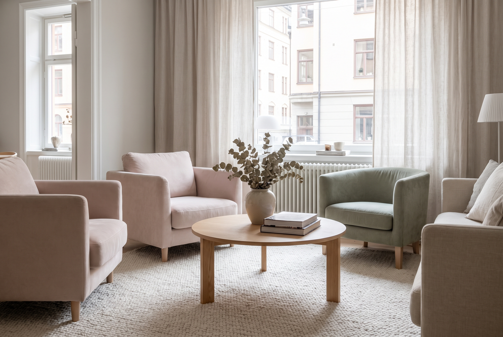
The same principle works across the palette. Try sage instead of mint, dusty blue instead of baby blue, clay pink instead of bubblegum, and oatmeal instead of butter yellow. These aren’t dramatic changes, but they can completely alter how a room feels.
It’s the Materials Doing the Damage
Pastel plus plastic can quickly read as juvenile. Pastel plus linen, wool, brass, stone, or raw wood feels much more considered.
Think about a pale pink plastic chair versus a dusty rose boucle sofa. They’re both using a soft pink family, but one feels playful and temporary while the other feels substantial and intentional.
The material gives the color context.
That’s why choosing the right finish can be just as important as choosing the right shade. If you’re bringing pastel into your home, don’t only ask, “Do I like this color?” Ask, “What is this color made of?”
That question can save you from a lot of decorating regrets.
The Rules That Make Pastel Decor Feel Grown-Up
1. Mute Every Color Down a Shade
Whatever pastel you’re naturally drawn toward, try going one shade dustier than your first instinct.
Love mint? Try sage.
Love bubblegum pink? Look for dusty rose.
Love baby yellow? Consider oatmeal or a faded straw shade.
Love powder blue? Try a smoky blue-gray.
This is especially useful when shopping online because product photography can make pastel colors look much brighter than they actually feel in a room. Look closely at the undertones and search for words such as “dusty,” “muted,” “chalky,” “weathered,” or “washed.”
The Scandinavian approach is less about making a color noticeable and more about letting it quietly become part of the room.
2. Pair Pastel With Something Structural
A soft pastel sofa surrounded by other soft, rounded, delicate pieces can quickly become too sweet. The easiest fix is to introduce something with hard edges or physical weight.
Try a black metal floor lamp beside a pale sofa. Put a chunky stone side table next to a pastel armchair. Add a dark wood console beneath a soft-colored piece of artwork.
Suddenly, the pastel looks intentional.
Black Is the Secret Weapon
A single black element in an otherwise pastel room can do more to make the palette feel grown-up than almost anything else.
Think of it as visual punctuation.
A black picture frame.
A black lamp base.
Black cabinet hardware.
Black candlesticks.
Black chair legs.
You don’t need much. In fact, keeping the black accents relatively small can make them even more effective.
The contrast gives the eye somewhere to land and stops the softer colors from blurring together.
3. Keep the Palette to Two Pastels, Max
This is another place where restraint really matters.
The nursery association gets stronger when you pile pastel pink, pastel blue, pastel yellow, pastel lavender, and pastel green into the same space.
Instead, choose one dominant pastel and, if you want another color, keep it subtle.
A dusty sage sofa might work with a muted clay cushion. A dusty blue bedroom could handle a little muted lilac. But let warm white, oatmeal, natural wood, beige, black, and taupe do most of the supporting work.
A limited palette feels calmer.
More importantly, it gives your chosen pastel room to breathe.
Where to Start, Room by Room
The Living Room
If you’re nervous about committing to pastel decor, start with upholstery rather than the walls.
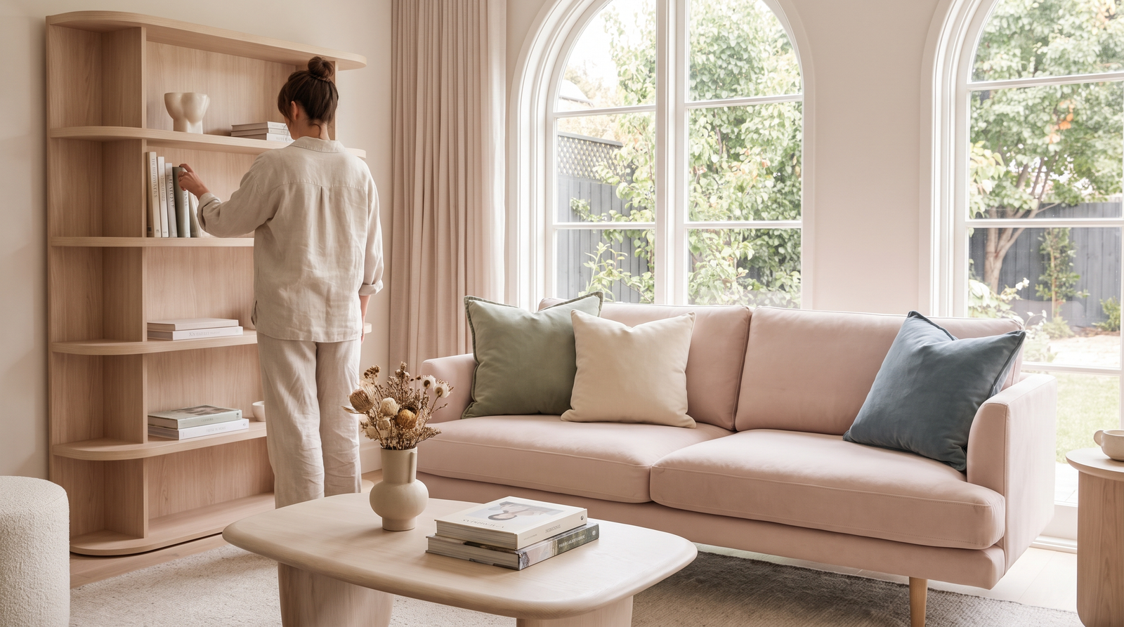
A dusty sage or clay-pink boucle sofa against warm white walls and natural wood furniture can completely change the mood of a living room without requiring a single can of paint.
Boucle is particularly useful because its texture adds depth to a soft color. Instead of looking flat and sugary, the upholstery feels tactile and substantial.
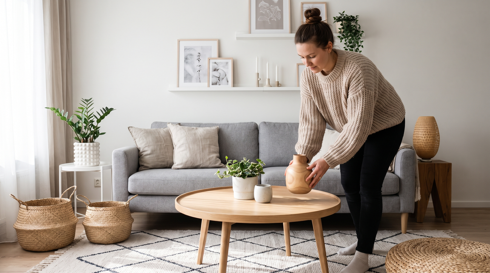
Pair the sofa with a natural wood coffee table, a black metal lamp, and neutral linen cushions. Add a wool throw in cream, taupe, or charcoal, and you’ve got contrast without clutter.
The result feels Scandinavian-inspired without looking like you’ve recreated a showroom.
The Bedroom
Bedrooms are naturally suited to soft colors, but this is also where the matching-set trap can become particularly obvious.
A muted lilac or dusty blue linen duvet set is a beautiful place to start. Pair it with warm wood furniture and simple black hardware.
Linen is especially effective here because its slightly wrinkled, irregular texture makes the room feel lived-in rather than precious.
Add a warm bedside lamp, a simple ceramic vase, and perhaps one deep-toned throw pillow in burgundy, forest green, or chocolate brown.
The result is soft but grounded.
Avoid the Matching Set Trap
Buying a fully matching pastel bedding set is one of the quickest ways to make a bedroom look like a child’s room.
Instead, mix your pastel duvet with a plain white pillowcase or a simple striped one.
You can also layer different neutral textures rather than introducing more pastel. A cream wool throw, oatmeal cushion, or natural linen pillowcase can make the bed feel much richer without adding another competing color.
Perfect coordination isn’t the goal.
Layering is.
The Kitchen
You don’t need to renovate your kitchen to experiment with Scandinavian pastel decor.
In fact, one of the easiest ways to test the trend is through accessories.
A dusty pastel-toned ceramic dinnerware set in muted terracotta or sage can introduce color without committing you to painted cabinets or pastel walls.
And don’t worry about making every plate identical.
Slight variations in tone can actually make the table feel more collected and less manufactured.
Pair the dinnerware with natural linen napkins, dark wood serving boards, and simple black candlesticks.
It’s a small change, but it can completely alter the atmosphere of an everyday meal.
The Textures That Keep Pastel From Feeling Sweet
Color gets most of the attention, but texture is arguably the secret ingredient.
Linen Over Cotton
Linen wrinkles. It drapes unevenly. It has a slightly rough hand-feel.
And that’s exactly why it works so well with pastel.
That natural imperfection prevents a soft color from looking too polished or precious. A muted lilac linen duvet feels relaxed in a way that a shiny pastel polyester duvet simply doesn’t.
Use linen for bedding, curtains, napkins, cushions, and even lampshades.
Raw Wood Over Painted Wood
Natural wood is practically a Scandinavian decorating essential for good reason.
Unfinished, lightly oiled, or naturally textured wood grounds a pastel palette in something earthy and organic. It keeps the room from feeling overly manufactured.
A pale pink chair beside a natural oak table feels completely different from the same chair beside a glossy pink table.
Let the grain show.
It adds warmth and visual character without competing with the pastel.
Matte Over Glossy
Finish matters more than you might expect.
A glossy pastel surface, particularly when combined with plastic or lacquer, is much more likely to give off a “toy” feeling.
Matte ceramic, chalky paint, brushed brass, natural stone, and softly finished wood create a much more sophisticated result.
If you’re choosing between two versions of the same pastel accessory, the matte one is often the safer bet.
How to Make Scandinavian Pastel Decor Feel Personal
There’s one final mistake worth avoiding: taking the Scandinavian look too literally.
Your home shouldn’t feel like a catalog.
If you love vintage furniture, include it. If you have a favorite piece of art, display it. If your grandmother’s wooden side table has a few scratches, don’t automatically replace it with something newer.
Those imperfections can actually make pastel decor more beautiful.
Soft colors work particularly well with pieces that have history because the contrast keeps them from feeling overly precious.
A dusty pink chair, an old walnut table, a vintage brass lamp, and modern black-framed artwork can all live together quite happily.
That’s what makes the style feel grown-up.
It’s not perfect.
It’s considered.
The Bottom Line
Pastel decor doesn’t have to mean baby blankets, nursery walls, or a room full of matching pink accessories. The Scandinavian approach proves that soft colors can feel remarkably sophisticated when they’re handled with a little restraint.
Mute your colors down a shade. Choose dusty rose over bubblegum pink, sage over mint, and oatmeal over butter yellow. Anchor those colors with something structural and slightly dark, whether that’s a black metal floor lamp, a dark wood console, or a chunky stone side table.
Then bring in natural materials wherever you can. Linen, wool, raw wood, aged brass, matte ceramic, and stone give pastel colors the weight they need to feel intentional.
And perhaps most importantly, don’t match everything too perfectly.
Let the shades shift. Let the textures contrast. Let a black accent interrupt all that softness. Let your home look collected rather than coordinated.
Do that, and a color palette many of us wrote off as something for nurseries and baby showers starts to feel like exactly what it can be: calm, warm, sophisticated, and surprisingly grown-up.
Pastel was never the problem.
It just needed better company.
One thought on “The Grown-Up Guide to Nordic Pastel Decor”