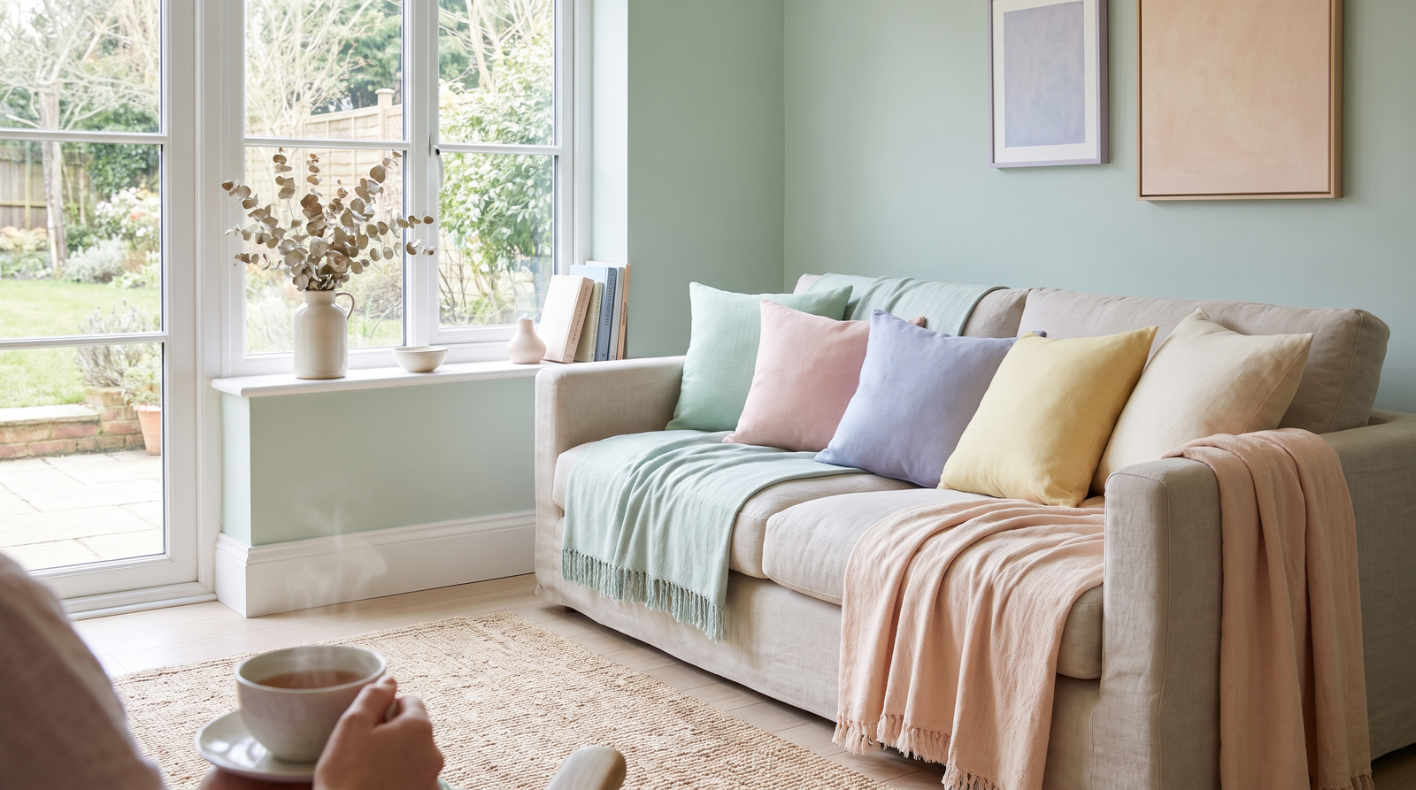
There’s a reason calming pastel color keep finding their way back into interiors.
All products are personally selected by us. If you buy something, we may earn an affiliate commission.
They’re soft without being completely neutral, colorful without demanding all the attention, and—when chosen carefully—surprisingly sophisticated. The problem is that pastels have a reputation for making rooms look overly sweet or busy; and honestly, that reputation isn’t entirely undeserved.
Choose a dozen pastel accessories in slightly different shades, add matching curtains, cushions, rugs, and artwork, and suddenly your living room looks less like a calm Scandinavian retreat and more like the aftermath of a particularly enthusiastic Easter sale.
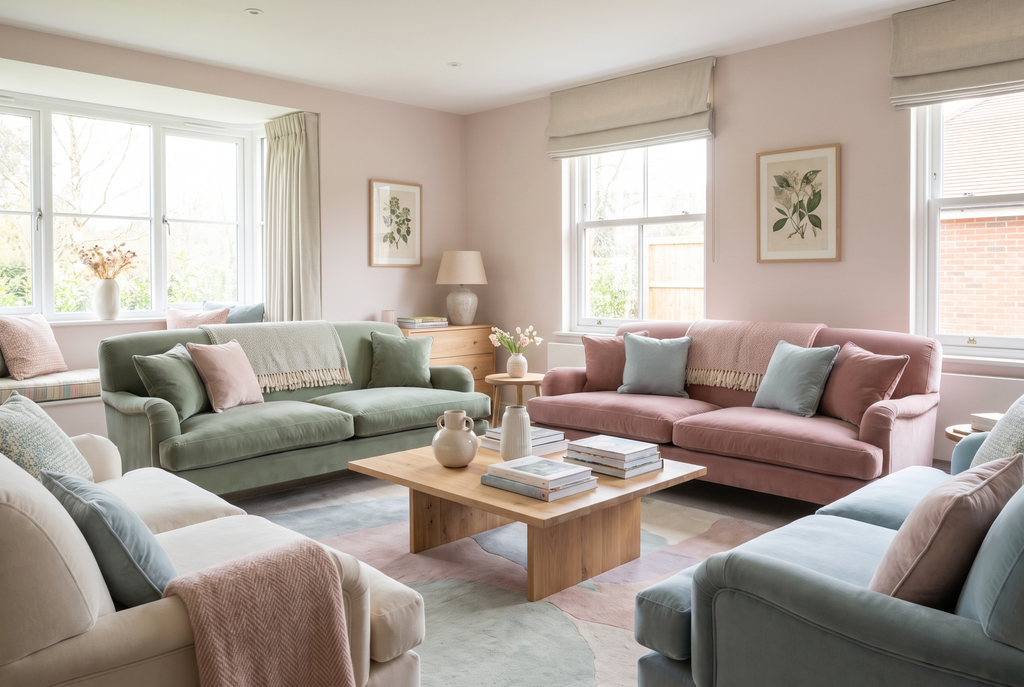
But pastel decor doesn’t have to work that way. The secret is choosing the right shade and giving it enough breathing room. The most beautiful pastel interiors tend to use colors that are slightly muted, dusty, or chalky rather than bright and candy-like. They’re paired with warm whites, natural wood, linen, stone, aged brass, and occasional darker accents. The result is a room that feels peaceful rather than precious.
Table of Contents
If you’ve been tempted by pastel decor but worried that your home might end up looking like a nursery, these seven colors are a much safer place to start. Each one can bring softness into a room while still feeling grown-up, collected, and wonderfully calm.
1. Dusty Rose
Let’s start with pink, because this is probably the pastel shade that gets misunderstood most often. Bright bubblegum pink can certainly feel youthful, but dusty rose is an entirely different story. With its subtle gray, beige, or earthy undertones, dusty rose feels warm, sophisticated, and almost vintage.
It works particularly well in living rooms and bedrooms because it adds warmth without overwhelming the space. Try using it on a boucle accent chair, a linen cushion, or a soft upholstered bench rather than covering every surface in pink. A dusty rose boucle chair beside a dark walnut side table is a particularly beautiful combination because the richness of the wood gives the pastel some visual weight.
For a smaller commitment, look for a dusty rose linen cushion or textured throw. It’s an easy way to test the color before investing in larger furniture.
Pair dusty rose with warm white, chocolate brown, natural oak, cream, or aged brass. If you want a little more contrast, add a small black accent such as a picture frame or lamp base.
Shop the look: A dusty rose boucle accent chair, washed-linen cushion, or aged-brass table lamp can introduce the shade without making the room feel overly pink.
2. Muted Sage Green
Sage may be the ultimate calming pastel for people who aren’t naturally drawn to pinks and blues. It’s soft, earthy, and connected to nature, which makes it particularly easy to live with.
Unlike mint green, which can sometimes feel sugary or retro, muted sage has enough gray in it to feel sophisticated. It looks beautiful against warm white walls and natural materials, making it a natural fit for Scandinavian-inspired interiors.
You can use sage on kitchen cabinetry, a bedroom duvet, an occasional chair, or even simple ceramic accessories. A sage linen duvet cover paired with warm wood nightstands and black metal hardware creates a bedroom that feels relaxed without becoming overly coordinated.
In the kitchen, try a set of sage ceramic dinner plates or serving bowls. They’re practical enough for everyday use but can instantly make a neutral table feel more considered.
Sage also pairs beautifully with terracotta, cream, oatmeal, walnut, and soft black.
The trick is to avoid combining it with too many other pastel shades. Let sage do the talking while the rest of the room stays relatively quiet.
3. Powder Blue
Powder blue can go wrong quickly. When it’s too bright or paired with lots of white plastic furniture, it can feel distinctly nursery-like. But a slightly smoky, gray-toned powder blue can be incredibly elegant.
Think of the blue you might see on an old painted cabinet rather than a children’s bedroom wall.
This shade works especially well in bedrooms and bathrooms, where its cool undertones naturally create a sense of calm. A washed powder-blue linen duvet can transform a bedroom without requiring any permanent changes to the walls.
Balance the coolness of the blue with warm materials. Natural oak, aged brass, woven baskets, and cream-colored textiles prevent the room from feeling cold.
For a more dramatic approach, combine powder blue with deep navy or chocolate brown. The darker color gives the pale blue definition and makes it feel much more intentional.
Shop the look: Look for powder-blue linen bedding, a matte ceramic vase, or a vintage-inspired blue table lamp. These pieces can bring color into the room without creating visual clutter.
4. Soft Clay
If you want a pastel that feels warm rather than sugary, soft clay is worth considering. It’s somewhere between a muted terracotta, pale peach, and dusty pink, depending on the exact shade.
This color has become especially popular in interiors because it works beautifully with natural materials. It feels earthy without being too dark and colorful without being loud.
A soft clay ceramic vase on a natural wood shelf can be enough to introduce the color. If you’re feeling more adventurous, consider a clay-toned upholstered dining chair or a set of ceramic dinnerware.
Soft clay looks particularly beautiful with cream, oatmeal, walnut, olive, and aged brass. It also works wonderfully with linen because the natural texture keeps the color from looking too polished.
For a dining room, consider clay-toned ceramic dinnerware mixed with neutral plates rather than buying an entire matching set. That slight variation will make the table feel collected rather than themed.
5. Muted Lilac
Lilac is one of those colors that can look either incredibly chic or surprisingly juvenile depending on how you use it. The secret is choosing a muted, gray-leaning version rather than an intensely purple pastel.
Muted lilac has a quiet elegance that works particularly well in bedrooms. A muted lilac linen duvet cover paired with warm white walls, natural wood furniture, and black metal details creates a soft but sophisticated atmosphere.
You can also use lilac in smaller doses through artwork, ceramics, cushions, or a small upholstered chair.
Because lilac has cooler undertones, it benefits from warm companions. Add cream, caramel, walnut, brass, or even a little burgundy to keep the room from feeling chilly.
And don’t underestimate the power of one deep accent. A burgundy throw pillow against a muted lilac bed can look unexpectedly beautiful.
Shop the look: A muted lilac linen duvet, matte ceramic vase, or small velvet cushion makes it easy to experiment with the shade.
6. Oatmeal
Technically, oatmeal sits closer to a warm neutral than a traditional pastel, but that’s exactly why it deserves a place on this list.
Oatmeal is what you reach for when you want color but don’t want visual noise.
It’s warm, soft, and incredibly versatile. Unlike bright beige, it has enough depth to make a room feel layered, while still providing the calm quality you’d expect from a neutral.
Use oatmeal on curtains, rugs, upholstery, bedding, or larger furniture. A natural oatmeal linen curtain panel can soften a room without introducing a strong color, while an oatmeal boucle ottoman can add texture and warmth to a neutral living room.
Oatmeal works particularly well alongside dusty rose, sage, soft clay, muted blue, and natural wood.
If your home already contains several colors and patterns, this may actually be the best pastel-inspired shade to choose because it creates a visual pause between stronger elements.
7. Pale Butter Yellow
Butter yellow is the cheerful member of this group, but it doesn’t have to be loud. The key is finding a faded, creamy version rather than a bright lemon yellow.
Think warm sunlight filtered through linen curtains.
That softer quality makes pale butter yellow surprisingly relaxing. It can brighten a north-facing room, warm up a minimalist kitchen, or add a little personality to an otherwise neutral bedroom.
Try it through a butter-yellow linen cushion, ceramic tableware, a small lamp, or an upholstered dining chair. You don’t need much.
Pale yellow looks especially good with natural oak, cream, muted sage, soft gray, and warm brass. For a slightly more sophisticated combination, introduce dark brown or walnut.
The contrast keeps the yellow from becoming too sweet.
How to Use Pastels Without Making Your Home Feel Cluttered
Choosing a beautiful pastel is only half the job. How you use it matters just as much.
The easiest rule to remember is one dominant pastel per room. You can introduce a second soft shade, but let the majority of the space remain neutral.
For example, if you’re decorating around sage, keep the walls warm white and use natural wood furniture. If dusty rose is your hero color, let cream, walnut, and black provide the supporting cast.
Don’t feel obligated to match everything.
In fact, slightly different shades usually look better together. A dusty rose cushion doesn’t need to perfectly match the pink in your artwork. A sage ceramic vase can be slightly darker than your chair.
That variation makes the room feel organic.
Let Texture Do the Decorating
When working with soft colors, texture becomes incredibly important.
A pastel room made entirely of smooth surfaces can feel flat. Introduce linen, wool, boucle, rattan, wood, stone, and matte ceramic instead.
A boucle accent chair adds softness. A linen duvet creates relaxed texture. A stone side table brings weight. A brushed brass lamp adds warmth. A natural wood console grounds the entire palette.
Notice that none of those pieces require another color. That’s the beauty of texture.
You can make a room feel rich without adding more visual information.
The Scandinavian Approach to Pastel Decor
Scandinavian interiors are a useful source of inspiration because they rarely treat color as something that needs to fill every available surface.
Instead, color is usually intentional.
A pastel chair might be the focal point. A muted duvet might be the only color in an otherwise neutral bedroom. A collection of ceramic pieces might introduce sage or clay into a kitchen.
The rest of the room gets to breathe.
That’s an important distinction.
A calm home isn’t necessarily a colorless home. It’s a home where every color has somewhere to sit.
Easy Pastel Pieces to Shop Without Redecorating
If you want to experiment without committing to paint or expensive furniture, start small. A few well-chosen accessories can completely change the atmosphere.
Consider adding:
- A dusty rose boucle accent chair for the living room.
- A sage linen duvet cover for the bedroom.
- A powder-blue linen cushion for a sofa or reading chair.
- A soft clay ceramic dinnerware set for the dining table.
- A muted lilac ceramic vase for a nightstand or shelf.
- An oatmeal boucle ottoman for texture.
- A butter-yellow linen cushion for a subtle hit of warmth.
- A brass-finish table lamp to give soft colors a more sophisticated edge.
- A dark walnut side table to ground pale upholstery.
- A black metal floor lamp for contrast.
The idea isn’t to buy everything on the list. Pick one or two pieces that solve a problem in your current space.
That’s usually enough.
Frequently Asked Questions
What are the most calming pastel colors for a home?
Muted sage, dusty rose, powder blue, soft clay, muted lilac, oatmeal, and pale butter yellow are excellent choices. Their softer undertones make them easier to live with than brighter pastel shades.
How do you make pastel colors look sophisticated?
Choose muted versions of pastels and pair them with natural materials, darker accents, and plenty of neutrals. Linen, wood, stone, aged brass, and black details can keep pastel colors from feeling childish.
Can you mix pastel colors in one room?
Yes, but restraint helps. Choose one dominant pastel and, at most, one secondary pastel. Keep the rest of the room grounded with warm white, oatmeal, natural wood, black, or other neutral shades.
What pastel color works best in a bedroom?
Muted lilac, dusty blue, sage, and dusty rose are particularly effective in bedrooms because they create a soft atmosphere. Linen bedding can make these colors feel even more relaxed and sophisticated.
Are pastel colors still stylish for interiors?
Absolutely. The current approach to pastel decor is less about bright candy colors and more about dusty, muted shades combined with natural materials and modern silhouettes.
The Final Word
Pastels don’t have to make your home feel cluttered, childish, or overly sweet. The secret isn’t avoiding color. It’s choosing color thoughtfully.
Dusty rose brings warmth. Muted sage connects a room to nature. Powder blue creates a quiet, airy feeling. Soft clay adds earthiness. Muted lilac brings a touch of understated romance. Oatmeal keeps things calm and versatile, while pale butter yellow adds just enough sunshine to make a space feel welcoming.
The most important thing is to give each color room to breathe.
Choose one dominant pastel. Pair it with warm neutrals and natural materials. Add darker elements when the room needs structure, and let texture do some of the visual work.
And when you’re shopping, don’t feel as though you need to redecorate the entire room. Sometimes a single sage linen duvet, dusty rose boucle chair, clay ceramic dinnerware set, or brass-finish lamp is all it takes to change the feeling of a space.
After all, the goal isn’t to make your home look like a pastel showroom.
It’s to make it feel calm, collected, and unmistakably yours.
One thought on “7 Calming Pastel Colors That Make a Home Feel Soft, Not Cluttered”